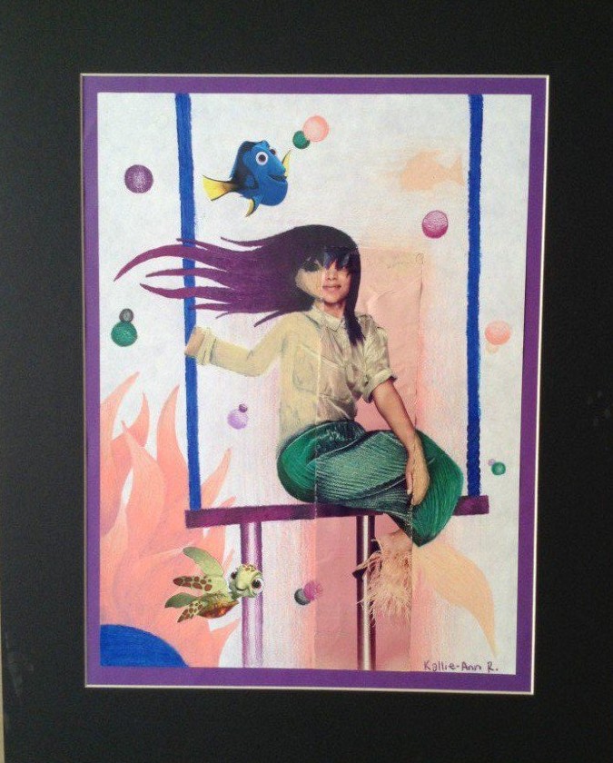
 The Integrating Images Pencil Crayon Project required us to include a magazine piece and make it look like it belongs. The goal was to unify the drawing, and to try to hide the magazine piece.
Throughout this project, I learned that experimentation is crucial in order to make an image belong. Mixing colours, whether analogous, complimentary, or simply adding black or white, can really make the difference between a bad, and perfect match. Good colour matching makes for a balanced image and a low contrast between the magazine piece and the paper.
The artistic elements of my drawing bring the image together due to successful colours, texture, and overall space and balance. Before I decided to add Dory, I was not planning on using any blue, but after adding Dory, I knew I needed to add blue in order to unify the drawing and make her look like she belongs. I repeated the wavy look of the tail in the seaweed and hair in order to help unify.
Kallie-Ann, I think you did a really good job with your color matching and balance on your drawing, as you mentioned. Your coloring transitions well and makes the magazine paper “disappear”. Your idea and use of space is also very imaginative. so, I think it was crucial for you to make smart choices with your color in order to have everything unified, and I think you succeeded in that. My only suggestion would be to pay closer attention to the facial proportions because your half of the face is slightly larger than the magazine. But, overall, this is a very nice work of art.
Thank you Maira. The facial proportions were however intentional do to a transition into my own, more cartoony style of drawing.